
Mobile-Friendly Tester
Check if your page is mobile-friendly and identify usability issues.
Enter a URL above to start the analysis.
What is Mobile-Friendly Tester?
Check if your website is mobile-friendly with our FREE test! Ensure fast loading, responsive design, and better rankings on mobile searches. Improve user experience now!.
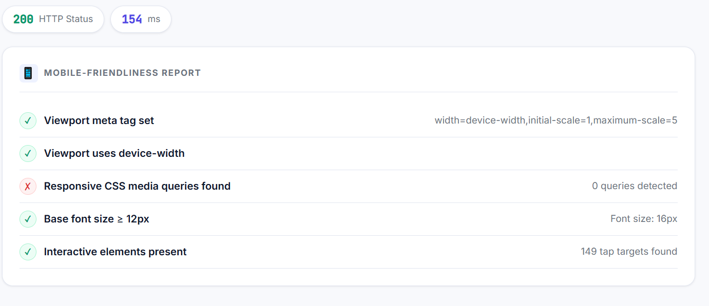
Fetches any URL and checks the key signals that determine mobile-friendliness: viewport meta tag, responsive CSS media queries, touch-action CSS, base font size, and the number of interactive elements. Reports a pass/fail for each check.
Why It Matters for SEO
Google uses mobile-first indexing — it crawls and indexes the mobile version of your site, not the desktop version. Pages that fail mobile-friendliness checks rank lower and may not appear in mobile search results.
How to Use This Tool
- 1 Enter the URL to test
- 2 Click Test Mobile Friendliness
- 3 Review the pass/fail checklist
- 4 Fix any failing items — start with the viewport meta tag
- 5 Retest after implementing fixes
Frequently Asked Questions
Yes. Since Google uses mobile-first indexing, your mobile version determines rankings on both desktop and mobile SERPs.
If on a CMS like WordPress, switch to a responsive theme. For custom sites, add viewport meta tag and wrap layouts in CSS media queries.
Google prioritizes mobile-friendly sites in search rankings. It improves user experience and reduces bounce rates.
Use responsive design, optimize images, and ensure clickable elements are spaced properly.
Yes,Get a FREE mobile-friendly report for your site. Fix issues, boost user experience, and rank higher.